


Global Village Coffeehouse Vs Corporate Memphis
A Tale of Two Art Styles

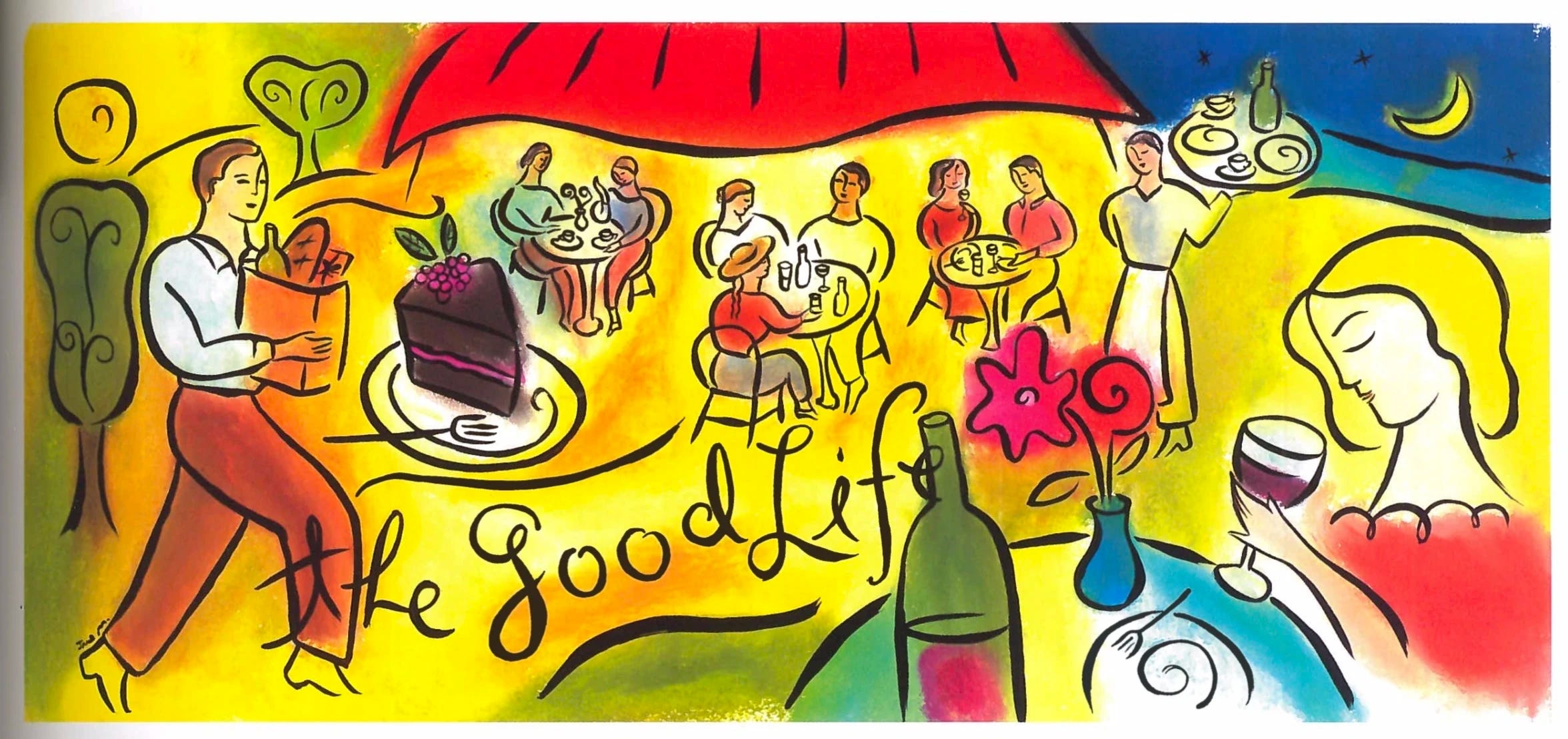
Let’s start off this post with a question: what’s the first thing that comes to your mind when you see this picture?
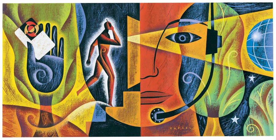
Or this one?
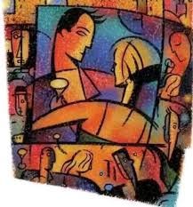
How about this one?
You might be thinking “huh, that design style looks familiar, but I can’t quite put my finger on why.” For me, personally, it reminds me of the art they had at the local bakery that my Mom brought me to get a black-and-white deli cookie in hopes that it’ll cheer me up after I scraped my knee falling down an exceptionally step hill as a kid.
Turns out, this art style has a name: Global Village Coffeehouse. The Aesthetics Wiki describes it as follows:
“Global Village Coffeehouse, abbreviated as GVC, is an aesthetic that was prevalent from roughly 1988 to 2004, overlapping with the Memphis Lite and Y2K aesthetics. It was inspired by the ambiance and cultural diversity often found in coffeehouses around the world. It blends elements of bohemian, eclectic, and cozy atmospheres with a touch of international flair.”
It then states that some of the defining features of GVC are “fusions of cultures,” “whimsical imagery,” “free-flowing lines,” and “focus on nature/environment.”
Comfy, isn’t it? I think it’s impossible to be in an environment with Global Village Coffeehouse imagery and be angry.
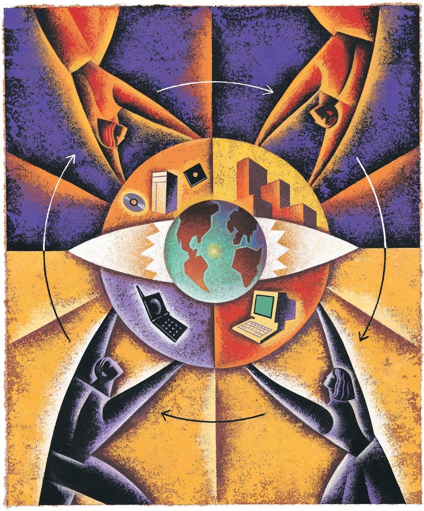
But sadly, Global Village Coffeehouse has fallen out of style. Instead, as the go-to corporate art style, we have this:


What does this remind you of? Unlike GVC, it sure doesn’t conjure up nostalgic memories of a pleasant outing, that’s for damn sure.
This much-loathed art style has many names. These include “Corporate Memphis,” “Alegria art,” “flat art,” or “globohomo1 artstyle.” It has also inspired many parodies and memes:

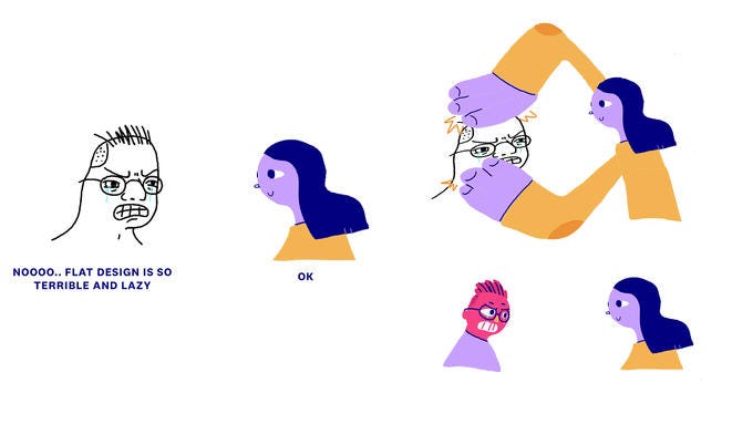
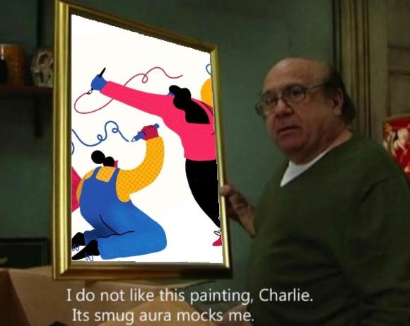
Corporate Memphis reminds you of a condescending “online sensitivity training seminar” the Powers That Be forces you to watch for work. It reminds you of someone who you kind of knew in college posting an infographic about a global conflict they just heard about a few hours ago. If you’re a Luddite, it might elicit the same disgust response you have when you see AI art- seeing something just so… so wrong being strutted around like its shit don’t stank is like seeing some walk around butt-naked at the public library and everyone else just acts like it’s normal. Actually, that analogy isn’t 100% correct, since at least a butt-naked person at the library could potentionally be an interesting piece of performance art. Meanwhile, Corporate Memphis is just so soulless and proud about it. It insists upon itself, as Peter Griffin once said.
Corporate Memphis also gives off a subliminal message that bland conformity should be valued above all else. I don’t know who created Global Village Coffeehouse, but I can tell that they have a genuine love for Earth and can appreciate the diversity of people in the world. Contrast this to Corporate Memphis, which portrays everyone as genderless, raceless, thoughtless monochromatic BLOBS. It’s like seeing a picture of the Berlin Wall and one side is glitter and disco while the other is gray uniforms and gruel lunches.
It’s ironic- the boomer anti-racism saying “I don’t care if you’re purple” has been criticized in recent years, I’m guessing it’s because it compares minorities to hypothetical mythical races. But what color is everyone in the oh-so-progressive Corporate Memphis style? That’s right- PURPLE!
It reminds me of this meme I saw floating around circa 2014:
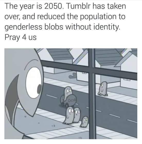
Whoever predicted this didn’t even have to wait until 2050, since the corporate art style has already accomplished that.
To end this post on a positive note, I recommend that corporations from here on should ditch the flat, lifeless Corporate Memphis aesthetic in favor of reviving the vibrant and lively style of Global Village Coffehouse. I think if GVC was reintroduced in Panera Breads and web pages around the world, the world would get a least 2% better by default.
Not homophobic, since “globohomo” is short for “global homogeneity” not the other word you’re thinking of. Also, a homosexual would know better than to unleash this art style onto the world.
dude I don't even know you (came across this article on google images of all places) but this is a great comparison of the two styles! I too wish panera breads and webpages would go back to GVC, or at least have creativity at all. one thing I'm also curious about is the origins of the new style- surely the first time it was used it was a little bit cool and fresh.